With iOS 18 being rumored to offer even more ways to organize apps on your iPhone’s Home Screen, it got me thinking about what I might do if those new customization features come to pass. However, I think I already have the perfect Home Screen for me.
I’ve been using an iPhone since the iPhone 3GS, so I’ve messed with all different kinds of Home Screen setups over the years. Apple has released a number of new ways to customize the Home Screen over the years as well. From widgets to folders to Shortcuts and the App Library, users have gotten more ways to customize and organize the apps on their iPhones.
These kinds of customization and organization options have resulted in some really unique Home Screens, but, to be honest, I haven’t strayed far from the default setup that comes preloaded when you get a new iPhone. After over a decade of using the iPhone, here are the 14 apps that I will always keep on my Home Screen.
Weather
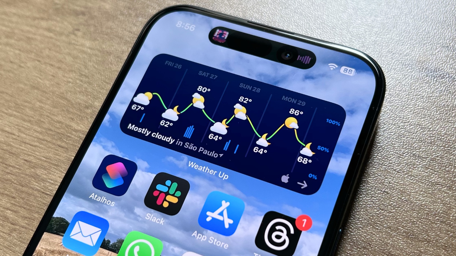
Get ready for some riveting content, people. Yes, I use the built-in Weather app on my iPhone (this will be a common theme). The only change I made with the Weather app was that, when Apple released widgets, I went ahead and use the Medium-sized widget at the top of my Home Screen.
Tech. Entertainment. Science. Your inbox.
Sign up for the most interesting tech & entertainment news out there.
By signing up, I agree to the Terms of Use and have reviewed the Privacy Notice.
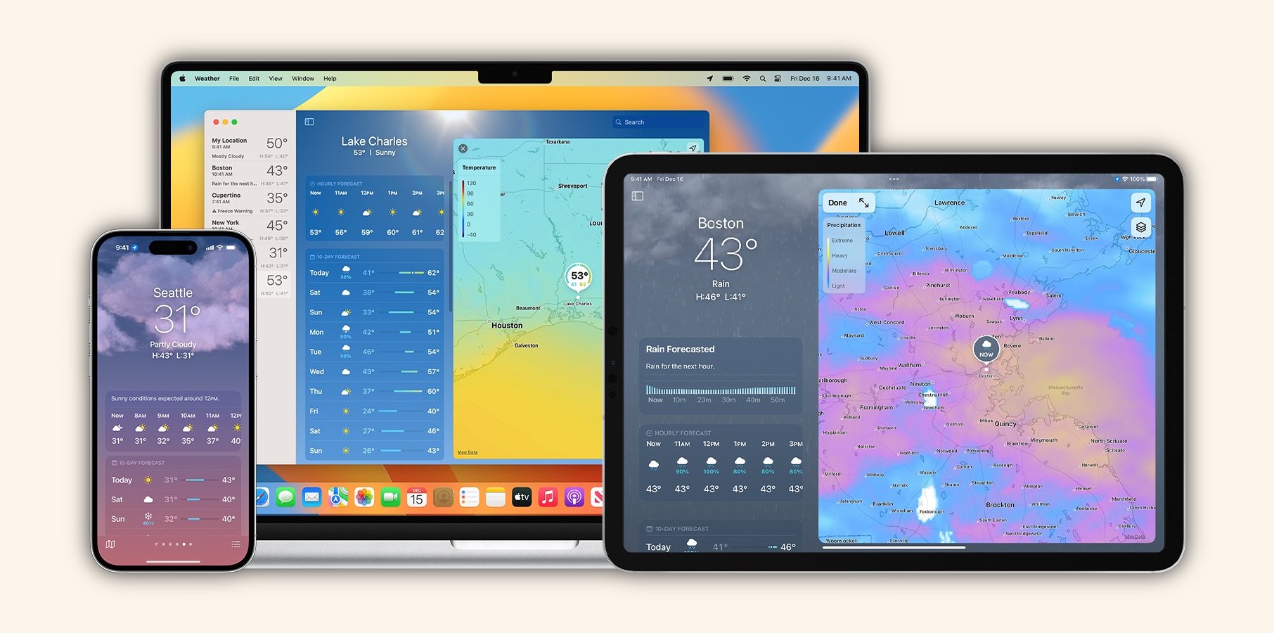
This is great — I get the current temperature and conditions in my location as well as the ability to see what the conditions in my area will look like for the next six hours. That’s all I need to know.
Yes, I also use the built-in Mail app on my iPhone. I’ve tried so many mail apps, but I always keep coming back to the one that Apple makes. I personally try to keep all work-related things off of my phone and my personal email address is with iCloud, so this works fine for me.
Be gone, Gmail. I may use you for work, but I don’t want you anywhere near my phone. I even tried to build a healthy relationship with keeping work apps on my phone with the use of Apple’s Focus feature, but it was evident this wouldn’t work for me. I ended up deleting Gmail from my iPhone for good and I don’t miss it. Sorry, coworkers. I’ll get back to you when I’m back at my desk.
Calendar
Yep, I use Apple’s built-in Calendar app Do you see a trend forming here? I think a lot of these decisions stem from keeping things simple, and there’s nothing as simple as using the built-in apps that Apple offers. This is also helped by, like I mentioned above, keeping work-related things off my phone.
Outside of my crazy work schedule (which I use Google Calendar for on my work laptop), my personal life isn’t complicated enough to warrant a full-featured calendar app. Apple’s Calendar app works for me just fine, so I’ll be using that for the time being.
Photos
This one is probably on everyone’s Home Screen, right? This one seems self-explanatory. I take photos and videos with my iPhone, so I’d like it to be easy to look at those photos and videos. Hence, the built-in Photos app is on my Home Screen.
I did get through a phase back in the day when Google didn’t charge for photos and video storage with Google Photos and switched to that service. However, once Google started charging, I switched back to Apple’s built-in solution and haven’t considered another option since.
Camera
Another built-in app! I personally — like most people — use the built-in camera app for the iPhone, and honestly, I always have. I’m not a photographer or a videographer, despite how cool I think it would be and I have found myself watching camera reviews on YouTube from time to time.
Despite those lapses in judgment, I always come back to my senses eventually and realize that I’m a writer and don’t need to download a more feature-rich camera app for my iPhone. I totally understand anyone who needs more professional features and settings, but that’s not me. Just point and tap for me.
Apple Maps
I feel like I’m still in the minority with this one. I am one of those people who have given Apple Maps second and third chances over the years, and I believe that the company has finally built a better maps app than Google.
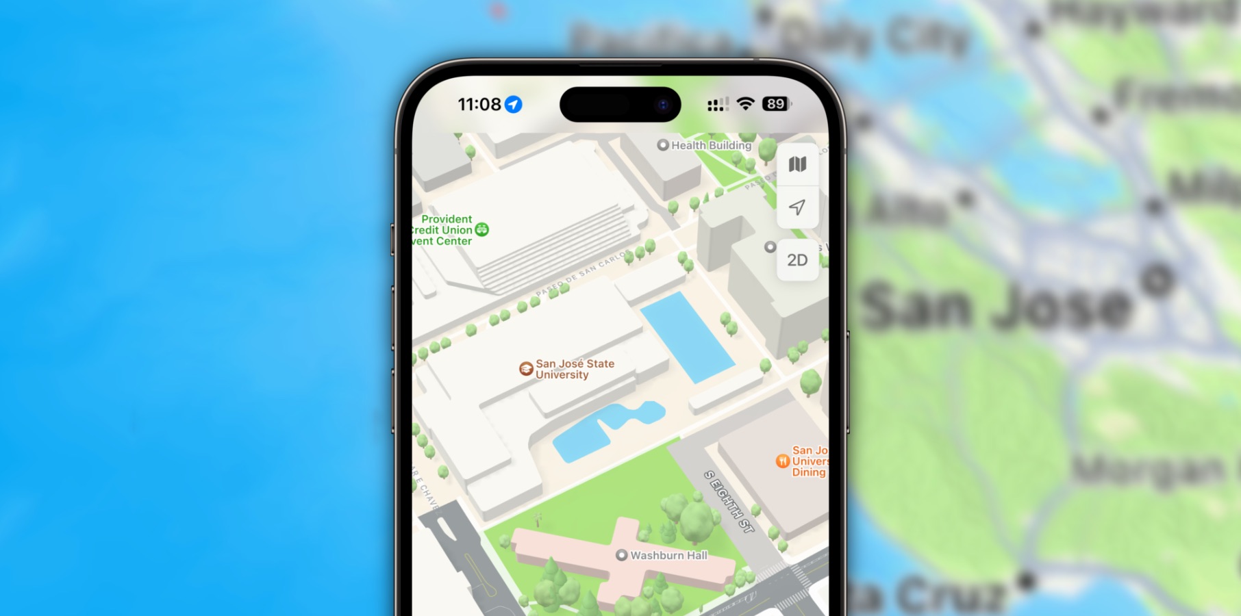
While Apple Maps certainly had a disastrous launch and that tainted the brand for years, the company has continued to work on improving the accuracy and experience so consistently that it’s been arguably better than Google Maps for a few years now.
I personally switched a few years back and haven’t felt the need to add Google Maps back to my iPhone at all. I know plenty of you will wholeheartedly disagree and swear by Google Maps, but I implore you to give it another try.
Notes
Despite there being a ton of productivity-driven apps out there, I don’t think there’s anything as clean and easy to use as Apple’s built-in Notes app. I’ve tried everything from Google Keep to Notion, but I always kept coming back to the good-old, tried-and-true Notes.
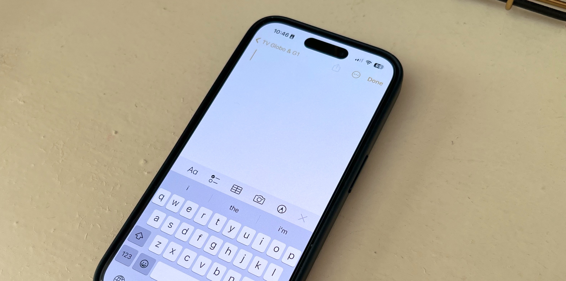
I don’t actually keep a ton of notes as it is, so I don’t need anything fancy here. All I need are some basic formatting options and the ability to pin notes to the top of this screen and organize them into some basic folders — both of which Notes provides.
Reminders
If you knew I kept Notes on the Home Screen, you probably saw this one coming. I love Apple’s Reminders app. I schedule almost every one of them to automate reminding myself about tons of stuff including the one bill I have to pay manually and reminders to clean certain areas of my apartment each day of the week.
If there’s anything I need to do on a regular basis, if it’s not already on my calendar, you can be sure that there’s a scheduled reminder set up to remind me to do that thing. That has been a game-changer for making sure I don’t forget to do certain things, especially since my memory is complete garbage.
Apple Podcasts
All of you Spotify fans get out of here. Apple Podcasts is where it’s at. Despite Spotify wading into the podcast business years ago, Apple Podcasts is still my podcast app of choice. Spotify’s app is so bloated at this point that Apple’s separate app feels much more simple and easy to navigate.
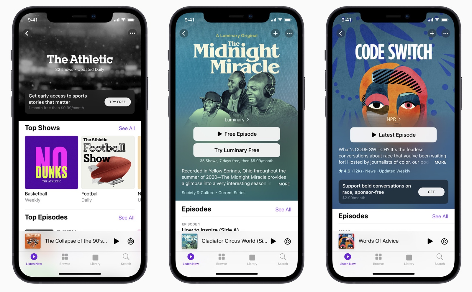
I know there are other beloved podcast apps out there like Overcast and Pocket Casts, but my podcast listening needs are basic enough to get away with the built-in app. Also, since the Podcasts app borrowed some design features from the Apple Music app — that Now Playing screen looks so good. I’m a sucker for good UI.
Phone
Ah, yes, the built-in phone app. Unlike some people, I still actually like to talk to people on the phone. Well, at least when I want to actually talk to people. Therefore, the Phone app lives in the dock on my Home Screen.
I’ll note that FaceTime is not on my Home Screen. While I find myself on my fair share of phone calls throughout the week (mostly talking to my family), I don’t end up on too many FaceTime calls. So, FaceTime has been banished to the App Library.
Safari
In my ongoing battle for personal privacy, I choose to use Safari on my iPhone over the Google Chrome app that the company makes for the iPhone. I only use Chrome for work purposes and don’t want Google anywhere near my personal data or browsing.
I know there are other apps from even more private browsing providers like DuckDuckGo, but I prefer the user experience and integration that Safari provides between devices (that walled garden, though). I do, however, use Ecosia as my search engine of choice across all my devices.
Messages
Since I live in the United States and have an iPhone, you can bet that I am locked into the iMessage ecosystem and use the built-in Messages app. Almost everyone else I know uses an iPhone as well (save one person), so that lock-in is hard at work here.
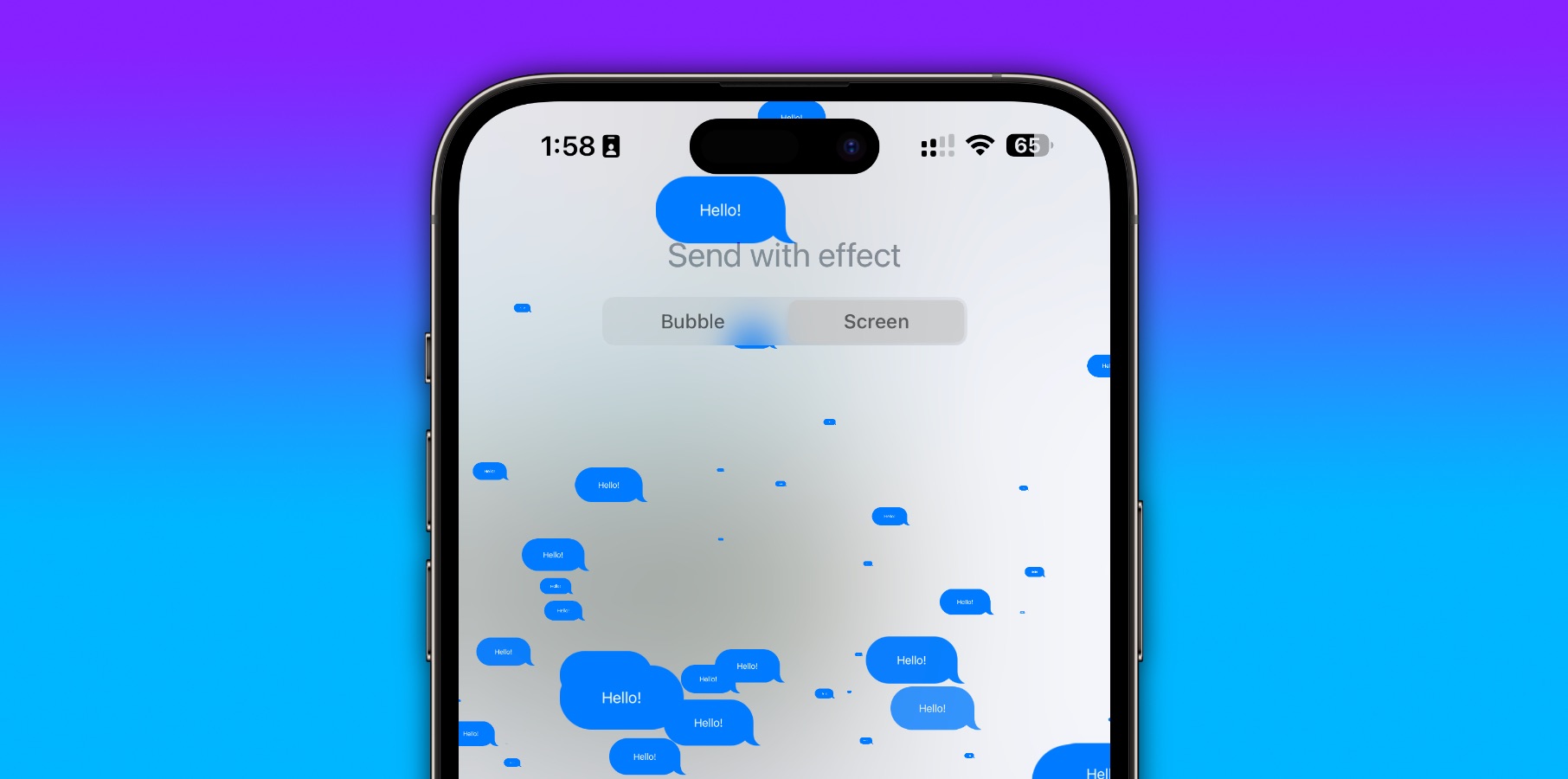
While there are plenty of messaging apps out there, the built-in one is the obvious choice for me since that’s where everyone else in my life is. And, since I’m not on social media anymore, it’s not the only way for me to communicate with a lot of those people.
Apple Music
The fight to the death between me and Spotify fans continues, but this one has been harder for me. Originally, I was a Spotify user when it initially launched in the United States years ago. However, over the years — specifically when Apple updated the design of the Apple Music app and launched its Apple One subscription bundle — I moved to Apple Music.
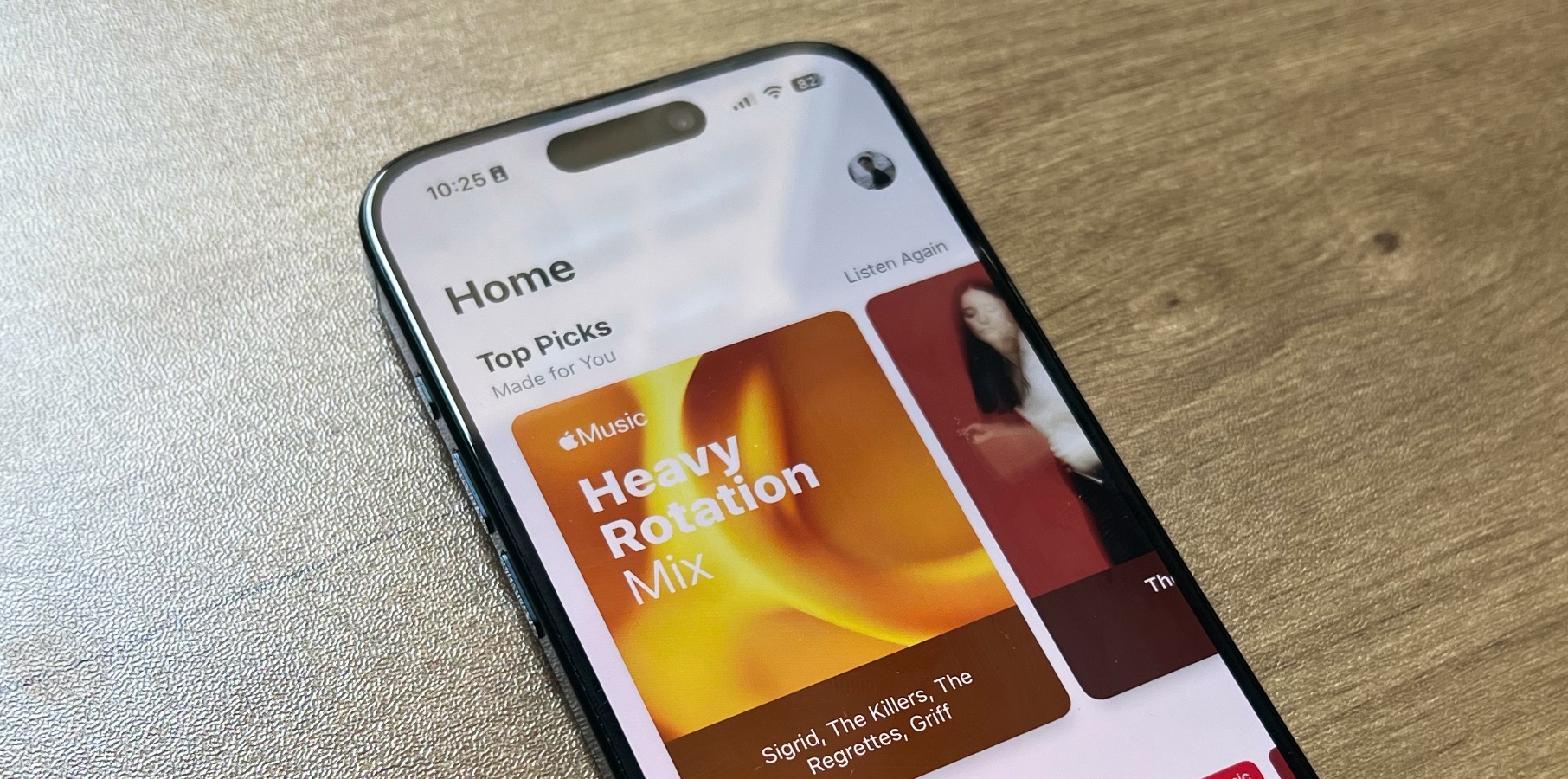
There are four reasons for this. First, I actually prefer having separate apps for my music, podcasts, and audiobooks. Second, I enjoy the savings I get with my Apple One subscription since I use all of the company’s services. Third, I’m snooty enough to notice the sound quality is better. And last, I actually prefer the design of the Apple Music app now.
Everyone is different
Of course, everyone is different, and the apps that make sense to live on my Home Screen might not make sense to you. It’s all subjective! But, at least for me, the above 14 apps are so key to how I live day to day that they have never left my Home Screen, and unless something drastic happens, I can’t see myself changing that anytime soon.
If you’re not boring like me and have customized your Home Screen like crazy with all kinds of third-party apps, you are better than I am to the developer community, and I applaud you.

