Chris Davies/SlashGear
EDITORS’ RATING: 9/10
- Dynamic Island makes the screen cutout useful
- Excellent cameras
- Solid battery and performance
- Beautiful display now supports always-on
- Going all-in on eSIM may be premature
- Still no USB-C
- Apple’s flagship is expensive
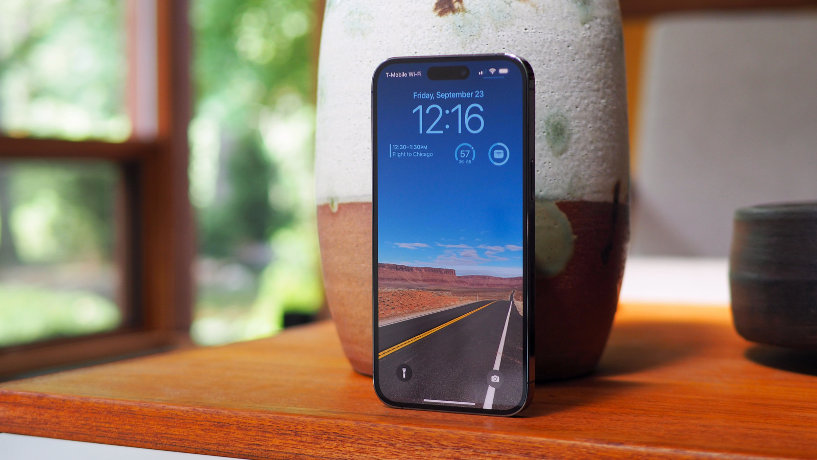
The iPhone 14 Pro Max is Apple’s biggest smartphone, its most expensive, and it makes the most aggressive promises. The 2022 iPhone line-up adds far more distance between Apple’s consumer and its prosumer models, with new features like the Dynamic Island, a brand new 48-megapixel main camera, and the latest A16 Bionic chipset sweetening the deal for the four-figure phones.
By the time you reach the iPhone 14 Pro Max, though, you’re facing a considerable investment — both physically and financially. Starting at $1,099 with 128GB of storage, and soaring all the way to $1,499 for the beefiest 1TB configuration, the cost of carrying Apple’s very best still stings. While many buyers may be tempted to compromise on screen size and opt for the 6.1-inch iPhone 14 Pro instead, there’s something to be said for going all-in.
Reassuringly solid
Chris Davies/SlashGear
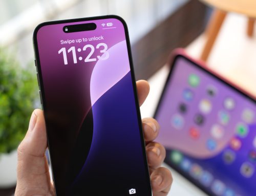
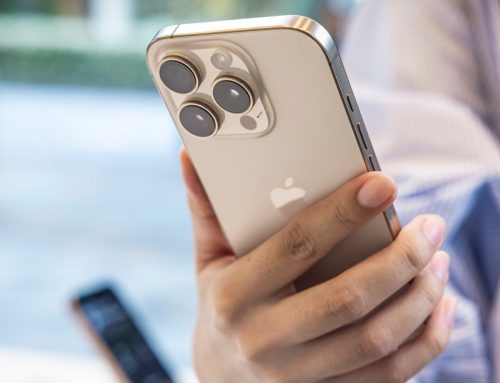
Apple hasn’t shifted the needle much in terms of design, here. The iPhone 14 Pro Max is still large, and heavy, and if that doesn’t make you want to slap a case on it, its crisp edges may with how they can dig into your fingers depending on how you’re holding it. Personally, the benefits of a big screen are enough to make toting it around worthwhile. 2022’s colors include Silver, Gold, Black, and Deep Purple.
There’s Ceramic Shield glass on the front again, which Apple says is the toughest protection around. I’m curious to see how it holds up to hairline scratches, however, something my iPhone 13 Pro Max has proved fairly happy to collect. I don’t use a case or a screen protector, so I’m clearly tempting fate, but the reality is that resilience to cracks doesn’t mean your shiny new gadget is impervious to any damage. IP68 compliance means dust and water shouldn’t be an issue, though.
While you may want to buy a case (any you have for your iPhone 13 Pro Max won’t fit), you won’t need to pick up a new USB-C cable. That’s because, unsurprisingly but ever more annoyingly, Apple sticks with Lightning and eschews the more commonplace connector. You still don’t get a charger (or headphones) in the box, either.
Finally, iOS gets an always-on display
Chris Davies/SlashGear
I can forgive it all, though, because I’m in love with Apple’s displays. The 6.7-inch Super Retina XDR on this iPhone 14 Pro Max is glorious, colorful, and smooth, with 120Hz ProMotion leaving everything feeling syrupy-slick. Peak brightness is up, too, to a hefty 2,000 nits. That makes a real difference in direct sunlight.
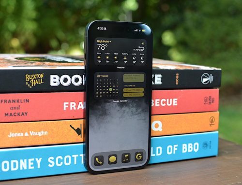
The biggest news, though, is the Always-On display. Is Apple the first to offer this? Certainly not, but that doesn’t mean it’s not worth celebrating. The screen dims and the refresh rate cranks all the way down to 1Hz, with the display coprocessor handling the graphics to keep things suitably frugal.
Even at lower brightness, the fact that you still see the wallpaper has confused me into thinking I left the screen switched on a few times. It’s going to take a little getting used to. As well as recent notifications you see the time, date, and the new iOS 16 widgets. The security setting which hides notification content until the phone is unlocked still applies, if you have that enabled, so people can see you have alerts but not what they actually say.
Switch into the Sleep Focus mode, meanwhile, and the display goes dark: useful when it’s on your nightstand, only lighting up when you tap the screen or lift the phone. Oddly, while you can adjust the time and date to a dimmer gray so as to be even less glaring when you check how early your insomnia has roused you, the carrier and status icons along the top, plus the flashlight and camera shortcuts at the bottom, all stay their usual glaring white.
Solid battery, but could charge faster
Chris Davies/SlashGear
Even with the new display engine, I wondered how the iPhone 14 Pro Max battery would hold up. Apple makes its usual all-day promises, with a charge apparently good for up to 25 hours of streaming video playback.
In practice, I got through a long day of cross-country travel — including playing music, handling email and messaging, internet and social media browsing, and some use of the camera — without issue. Wireless charging support means that it’s easy to drop the iPhone 14 Pro Max down onto a MagSafe or generic Qi charging pad and top up its battery during downtime.
I can’t help but wish Apple had improved charging speeds, though. MagSafe tops out at 15W; third-party wireless chargers are capped at 7.5W still. If you have a 20W wired charger you can go from flat to 50% in around 35 minutes, which is fine, but it seems a little paltry in comparison to the 45W+ support that rival flagship smartphones are launching with these days.
A new chipset and the promise of longevity
Chris Davies/SlashGear
Bucking prior launches, not every new iPhone in 2022 gets the same chipset upgrade. Only the iPhone 14 Pro Max and iPhone 14 Pro benefit from the latest Apple A16 Bionic; while that doesn’t really seem to make much difference now, with iOS 16 as comes preloaded, you might wonder whether it’ll give the more expensive phones a little more longevity than the iPhone 14 when there are several more generations of iOS release under Apple’s belt.
Is that reassurance nice to have? Certainly. Is it worth paying at least $999 for an iPhone 14 Pro, or $1,099 for an iPhone 14 Pro Max to secure it? That’s only something individual buyers can answer; Apple does a better job than most at keeping its older phones updated, so the bigger question may well be just how long do you think you can resist the allure of the hardware upgrade?
The big camera update for 2022
Chris Davies/SlashGear
Apple’s camera upgrades add further distance between the iPhone 14 Pro Max and its cheaper iPhone 14 and iPhone 14 Plus. As before, you get three sensors — wide, ultra-wide, and telephoto — but the hardware is new, and they protrude a little further from the rear of the smartphone than on last year’s model.
Chris Davies/SlashGear
The main camera now uses a 48-megapixel sensor, up from the 12-megapixel unit in the otherwise most-recent model. Apple uses that in two ways, first relying on pixel binning — that is to say, combining data from clusters of pixels into a single pixel in the final image — to coax more color, detail, and brightness accuracy into the default 12-megapixel photo. It’s not a new method, but it’s new for Apple, and it’s been tightly integrated into its freshly-named Photonic Engine.
Chris Davies/SlashGear
That’s fancy branding for things like Smart HDR, Deep Fusion, and the other computational photography magic that Apple has been using to bring more brightness into night shots and similar. The results are, generally, excellent, though there’s not a night-and-day improvement over what you get from an iPhone 13 Pro Max. Think more detail when you zoom in close, and a little more natural low-light enhancement. You can, if you want to, switch to ProRAW mode and capture the full, 48-megapixel image, though I suspect that’ll be a niche requirement.
Photonic Engine is more than just branding
Chris Davies/SlashGear
Apple’s other use for the higher-resolution sensor is to take a crop from the center that it uses as a lossless 2x zoom. Of course, in the process you don’t get the pixel binning magic (since now one pixel on the sensor maps directly to one pixel in the final shot), but it does mean the additional of a fourth zoom option alongside the 0.5 ultra wide and dedicated 3x optical telephoto. If, like me, you find that the jump from 1x to 3x can sometimes leave you a bit too close, the 2x is a nice halfway measure.
Chris Davies/SlashGear
The 12-megapixel 3x telephoto, meanwhile, promises color and detail improvements thanks to the Photonic Engine, while the ultra-wide is a much larger sensor that also promises better focus. I’ve always felt like the ultra-wide was the least compelling of the Pro-series iPhone’s cameras, but this upgrade helps it keep up with its sensor siblings.
Chris Davies/SlashGear
That tech also gets used by the new TrueDepth camera on the front, which now has a faster aperture and autofocus. The difference isn’t, again, a night-and-day affair, but low-light shots are clearer.
A great everyday camera
Chris Davies/SlashGear
Despite the extra megapixels, it’s not an entirely clean sweep. Mixed lighting scenes — think the shadows under trees with clearer patches of brighter sky — can fall short of the clarity and detail that rivals like Google’s Pixel 6 deliver. Not always, and I’m not saying I’m disappointed by Apple’s phone in general, but it’s a reminder that software and decisions about how contrast, exposure, and other settings are handled play a huge role in the final image saved.
Chris Davies/SlashGear
The same goes for some of the other computational trickery. Portrait mode is good but still struggles in places with fine edge detail like pet fur. Sometimes, indeed, it proved better to stick with the regular mode and enjoy the regular f/1.78 aperture’s native blurring at the 24mm or 48mm equivalents.
Chris Davies/SlashGear
For video, Apple’s changes focus on an update to Cinematic mode to support 4K resolution, and the addition of Action mode for even more improved stabilization. The former still feels gimmicky to me; the latter is much more impressive and does a great job of smoothing out footage. The downside is that it tops out at 2.8K resolution and 60fps, rather than the 4K the sensor itself can deliver with Action mode turned off.
Dynamic Island is a bold destination
Chris Davies/SlashGear
The Dynamic Island is interesting, I think, because rather than the strategy of ignoring controversy about the notch, Apple is leaning into its design decisions in a way that involves both hardware and software. Clearly, though under-display cameras exist — and, frankly, still are far from the equal of cameras that peer through a screen cut-out — they’re not ready to deliver the combination of photography and biometric security that Apple demands of the TrueDepth array. Some sort of front-facing sensor system is an inevitability, then.
Chris Davies/SlashGear
The question thus becomes where you put it: a notch, which seems vaguely apologetic; a thicker bezel, which runs counter to the slim profile Apple has been chasing for generations of iPhone; or a more obvious cut-out. To sweeten the deal, the resulting Dynamic Island is wrapped into a UI element in its own right.
Smoothly amorphous, swelling and shrinking like some oddly-shaped pupil, it expands to encompass alerts, shortcuts, and system notifications, then condenses down once more like a diminutive black hole. If you have two apps running — music, say, and a timer — then the Dynamic Island splits apart, like ink droplets. Time-sensitive content, like upcoming navigation instructions in Apple Maps, see it erupt into life: attention-grabbing, certainly, but not at the expense of what you were looking at.
Settling into island life
Chris Davies/SlashGear
There’s still room for improvement, mind, and not all of it Apple’s. It feels weird to long-press the Dynamic Island in order to access its widget functionality; a quick tap, which currently switches to the app itself, would seem like a more obvious interaction when brevity is of the essence. Third-party apps can integrate with Apple’s APIs, but unsurprisingly there’s not much of that for the moment. We’ll need developers to catch up.
Chris Davies/SlashGear
The big question — certainly the one people have asked me most so far — is whether you notice the Dynamic Island more, or less, than the notch on the regular iPhone 14. With the context that I quickly came to ignore that cut-out, I’d say Apple’s new display divot is a little more intrusive, but not to the point where I really “see” it as I interact with the smartphone. At least, not until it awakens and does something interesting.
Impressive features you don’t want to try
Chris Davies/SlashGear
Apple’s other big feature additions — shared with the iPhone 14 — are trickier to test. Emergency SOS uses satellite connectivity to unlock a last-ditch route to contact help. It bucks the trend of traditional satellite phones, requiring no chunky antenna, though you’ll still need a line of sight to the orbiting relay itself. That, your iPhone will walk you through, including a selection of canned questions (think Clippy but “It looks like you’ve broken your ankle on a mountainside…”) to maximize the usefulness of the minimal bandwidth.
Similarly, crash detection harnesses various sensors to spot when you’re in a collision or other incident, and automagically summon the emergency services. It can’t be coaxed into action by aggressive braking, so we’ll just have to take Apple’s word for it that it’ll kick in were I actually to slam my car into a wall.
There’s a tendency at the moment to accuse Apple of leaning into fear and the threat of disaster with its more recent launches. Certainly, the company has never shied from real-life case stories of people saved from coronary by their plucky Apple Watch; I’ve no doubt we’ll hear similar reports about Emergency SOS and crash detection at the next big keynote.
Still, it’s an odd complaint, I think. We carry these near-permanently connected, location-tracking, habit-learning devices with us every day, accepting the downsides to such things because they make it easier to take photos, and get directions, and listen to music, and spend too much time on Twitter and TikTok. The idea of us then blanching because they also offer to watch out for us in times of actual disaster seems weird. You can, if you feel differently, simply not use either feature.
eSIM all the things
Chris Davies/SlashGear
Where Apple may deserve a little more criticism is its wholesale embrace of eSIM, at least in the U.S. market. There are certainly benefits to electronic SIM cards rather than their physical counterparts — Apple likes to highlight the fact that, with eSIM, phone thieves can’t quickly whip out your SIM and thus disable location tracking — and in a perfect world the idea of being able to quickly and simply add, swap, and remove lines of service, whether home or abroad, has clear appeal.
Like the decision several years back to go all-in on USB-C on its laptops, though, Apple’s decision to lead the timeline on eSIM leaves customers no option to come along for the ride. I switched both a T-Mobile SIM and a Verizon eSIM to eSIM on two different iPhone 14 models; both times it was smooth and took a matter of minutes. Others have reported more headaches, particularly when coming from Android phones.
While iOS does its best to make switching straightforward, there’s no one-stop store for eSIM and service on the iPhone itself, unlike on an iPad where you can activate roaming data without needing to talk to a carrier. And the U.S. carriers themselves — though clearly giddy with glee at having more potential to say whether you can use their service or not with your particular device — aren’t quite at the level of “move your subscription around with zero hassle and zero headaches” that eSIM promises.
The big question is whether we’ll get there before the frustrations of not being able to drop any SIM into an unlocked phone bite. As someone who travels internationally a fair amount, I do find I’m less likely to go hunting for a local SIM as my first task upon landing. More generous roaming bundles from home carriers play a big part, there. Reality is, though, if you want the latest iPhone then you’re automatically along for the ride with Apple’s eSIM experiment, and it’s hard to imagine them backtracking and adding the slot back in again in the future.
iPhone 14 Pro Max Verdict
Chris Davies/SlashGear
Indeed, a lot about the iPhone 14 Pro Max feels like Apple setting the stage for its next iteration of smartphones. The Dynamic Island feels as much of a shift as the notch did on the iPhone X; the upgraded cameras are a step up in the software and hardware blend of Apple’s computational photography. If the iPhone 14 feels familiar, its Pro counterparts pave the way for what 2023 and beyond might focus on.
It’s not an entirely clean sweep. The decision to stick with WiFi 6 rather than switch to 6E probably won’t impact many today, but runs counter to Apple’s ethos of future-proofing elsewhere. Going all-in on eSIM feels aggressive or even premature, and there are times I’m not convinced the camera software is getting the most out of the iPhone 14 Pro Max’s hardware.
All the same, the upgrade decision here is a lot more straightforward than elsewhere in the 2022 iPhone line-up. You’re getting some notable improvements wrapped in a familiar — but unquestionably premium — design, and that combined with the longevity of Apple’s hardware and software pulls a little of the sting of the iPhone 14 Pro Max’s $1,099 starting price. As a showcase for iOS 16, and a preview of where Apple sees smartphones developing in the next few years, it’s a more-than-compelling device that earns its flagship billing.

