Hands-on —
The iPhone 14 looks the same, but the 14 Pro offers an alternative to the notch.
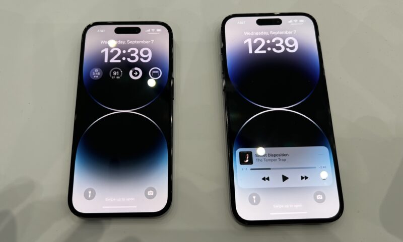
Enlarge / The iPhone 14 Pro and the iPhone 14 Pro Max.
Samuel Axon
CUPERTINO, Calif.—Today, Apple revealed its 2022 flagship iPhone lineup, including the iPhone 14, iPhone 14 Plus, iPhone 14 Pro, and iPhone 14 Pro Max. While there were few surprises after months of accurate leaks, and the fundamental design hasn’t changed yearly, there are some interesting new things to see—particularly with the Pro phones.
We spent a few minutes handling the new devices and taking photos at a showroom within Apple’s Steve Jobs Theater. While we only had a few moments with each device, we walked away with the impression that at least as much as things change, they ultimately stay the same. The phones feel the same in your hands and offer most of the same features as other recent flagship iPhones.
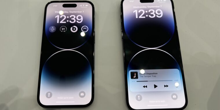
To that point, here are our photos of the iPhone 14 and iPhone 14 Plus. The 6.7-inch Plus phone replaces the 5.4-inch mini in the iPhone 14 lineup, while the iPhone 14 has pretty much the same dimensions as the iPhone 13.
-
On the left: iPhone 14. On the right: iPhone 14 Plus. Each shows a configuration of the new always-on lock screen functionality in iOS 16.
Samuel Axon -
A look on the other side reveals a camera system that looks pretty much the same as what we saw in the iPhone 13, even though there are some improvements.
Samuel Axon -
That bump is pretty substantial.
Samuel Axon -
Lightning returns. Sorry, regulators.
Samuel Axon -
Here’s a look at the sides of the two phones, with the same button arrangements as last year.
Samuel Axon -
Here’s a closer look at the notch, which is still there in the iPhone 14 even though it’s been replaced by a new solution in the iPhone 14 Pro.
Samuel Axon
The biggest visible change, then, is on the Pro models, seen below. The notch is gone, replaced by a camera cutout near the top of the screen that is made to look like a UI element—with functionality and everything—thanks to the iOS software and the true-black, per-pixel illumination OLED screen tech.
-
Here’s the new always-on home screen and camera cutout on the iPhone 14 Pro.
Samuel Axon -
Here on the iPhone 14 Pro Max, you can see that the UI changes around the cutout to accommodate live updates on certain apps—in this case, Music on the left and Clock on the right.
Samuel Axon -
Tapping the Music indicator expands to reveal music playback controls.
Samuel Axon -
Here’s another new feature: the’s one additional zoom level at 2x, in addition to 0.5x, 1x, and 3x. (Older iPhones had 2x, but it was replaced by 3x. Now it’s back alongside that newer zoom level.)
Samuel Axon -
Here’s the back of one of the phones. It looks pretty similar to last year’s Pro models.
Samuel Axon -
The camera bump is enormous, and the phone is very wobbly when placed flat on a table.
Samuel Axon -
Lightning returns in this phone too.
-
Here’s a quick look a the side. Not much new here!
Samuel Axon
We were impressed by the new cutout. Going in, there was a certain degree of skepticism—it didn’t seem like a cutout was any better than a notch. But Apple has made some clever software choices to turn a weakness into a feature—and the company did it in a way that few Android phone makers could do to counter it in exactly the same way.
The animations are snappy, the shapes are clever, the functionality is useful, and the pill at the top feels a bit like the swipe-up indicator at the bottom of the phone—an ever-present UI element.
It’s not enough of an upgrade to the iPhone 13 Pro—or even maybe a couple of generations before that, either. But it’s a flashy, clever way to address a long-standing thorn in the modern smartphone design’s side.
Otherwise, though, it was business as usual with these phones, in our brief experience. The two biggest new additions besides the Pro’s notch redesign—improved cameras and satellite functionality—weren’t something we could appropriately test in this venue. Those will have to wait for our reviews in the coming weeks.

