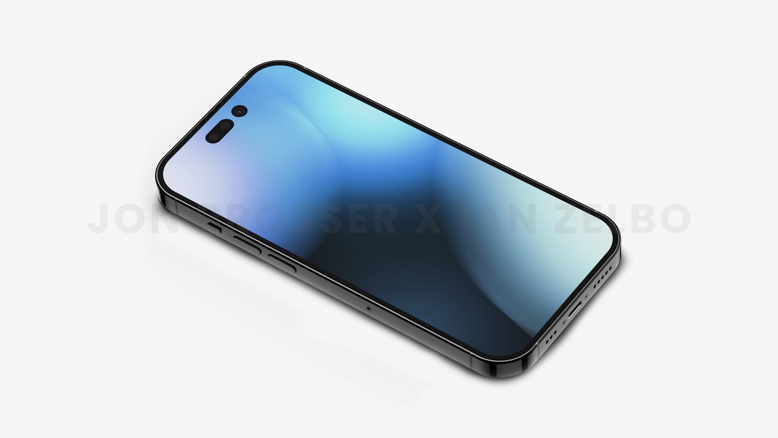
We’ve been talking about the iPhone 14 Pro’s pill-and-hole design all year long. That means we’ve had time to get used to the upcoming new display cutout design for almost a year. But a series of last-minute iPhone 14 Pro leaks revealed Apple’s plans to merge the pill-shaped cutout with the circular one.
The resulting notch replacement is an elongated pill cutout, similar to what various Android vendors did in the years that followed the iPhone X launch. With that in mind, I still hope that Apple will let users customize the pill cutout on the iPhone 14 Pro. Because let me tell you right now, I like the asymmetrical i-shaped cutouts a lot more than just one elongated pill.
Reports this week said that Apple will use the display space between the pill and hole-punch cutouts to show camera and microphone indicators. But when the privacy indicators aren’t in use, the display space between the pill and the hole-punch will supposedly stay black. The result is a longer pill-shaped cutout that should be about as long as the iPhone 13 notch.
This will give the iPhone 14 Pro a symmetrical design, just like the notch. And, just like the notch, the elongated pill will be a great marketing tool. Everybody will recognize this long pill and associate it with the iPhone.
That said, there’s beauty in asymmetry.
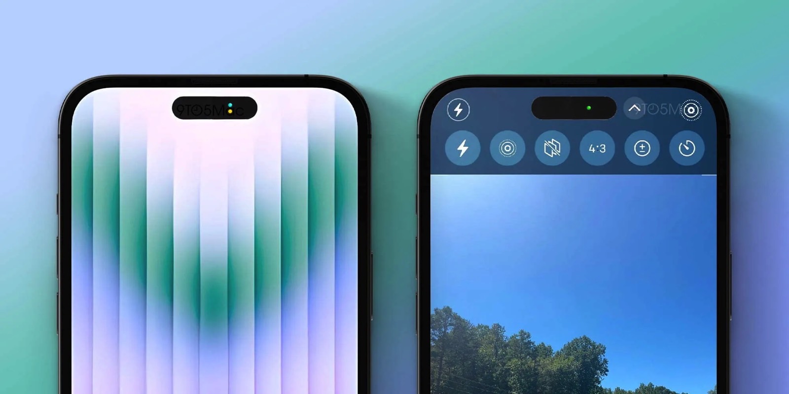
Hole-punch cutouts do not have to be placed centrally. We’ve seen that on various Android phones in recent years. And I do like the horizontal “i” shape of the rumored pill-and-hole iPhone 14 Pro display cutouts more than the elongated pill that leaked this week.
With that in mind, I’d certainly love to be able to customize the look of the notch replacement from the iPhone 14’s settings. That is, I want the option to turn on the tiny display area between the pill and hole-punch cutouts. The display area could still show the privacy indicators whenever the camera or microphone is in use.
After all, Apple has been much more open to customization on iPhone. iOS 16’s main feature is a Lock Screen redesign that’s all about making the iPhone experience unique. You can also change the default browser and mail apps on your iPhone. And you can customize the Safari experience by choosing your preferred Safari Address Bar placement.
Having the ability to change up the look of the iPhone 14 Pro’s new notch replacement would fall into a similar category.
That said, it’s unlikely that Apple would do this. In addition to housing the Face ID components, the notch design gives the iPhone its own unique identity. It’s part of the branding. Apple would likely want every iPhone 14 Pro model in circulation to have the same design.
More iPhone coverage: For more iPhone news, visit our iPhone 14 guide.

