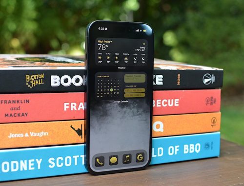
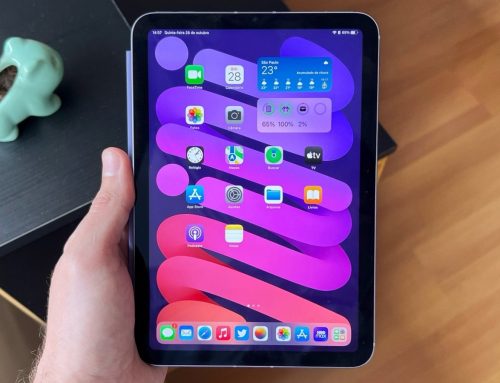
The general trend of macOS releases over the past few years is that it has been moving closer and closer to the look and feel of iOS. The icons have become iOS icons, and their shape has become the iOS shape, and you can now use your iPhone as the Mac’s webcam, etc. etc. This occasionally comes at the expense of other functionality (ask me how I feel about the new Settings menu), but it is the direction that Apple has clearly been heading in since (arguably) Big Sur. Every so often, other splashy features are announced (Stage Manager, Universal Control, Quick Notes) that I write a lot about and then never end up using ever again.
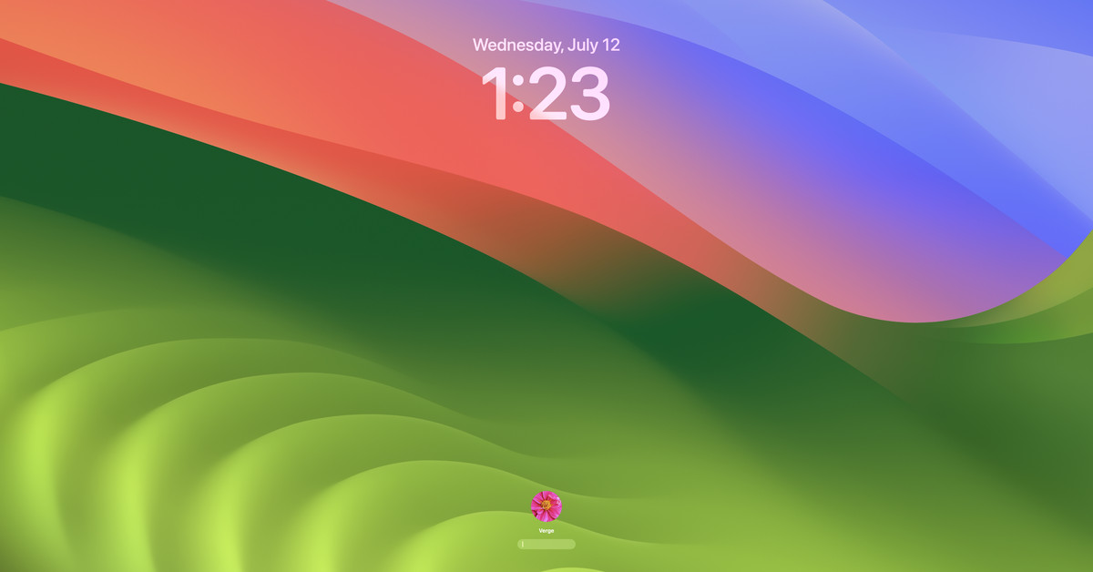
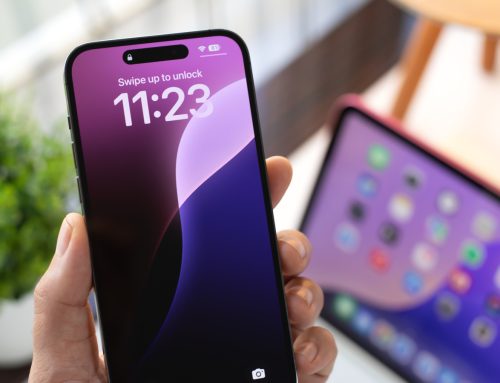
So, good news for Continuity fans: that’s basically what’s going on with Sonoma. Ventura looked a heck of a lot like iOS, and Sonoma looks even more like iOS. I turned my office’s Mac Studio on after installing the developer beta and thought, for a second, that I might be hallucinating my iPhone’s lockscreen. It’s remarkably reminiscent.
But in case that wasn’t enough of an iPhone vibe for you, the other big update that comes with this public beta is that you can now put widgets on your desktop. Widgets! They intelligently tint based on the color of your desktop, and they’re available for various Apple apps, including Safari, Contacts, and Podcasts.
Now, this is neat. It also strikes me as one of those iOS carryovers that doesn’t make a whole lot of sense on a computer. Personally, I find the benefit of widgets on iPhone largely to be that you glance at them while you’re grocery shopping or waiting for the bus or whatever and don’t have time to open the actual app. The use case for having them on a computer desktop is not as clear to me — I don’t have the occasion to quickly glance at my computer’s blank desktop while doing something else nearly as commonly. I suspect that the primary impact of having widgets on the desktop is that it makes your Mac look a lot more like your iPhone. I have hope that third-party developers might figure out fun and exciting use cases for desktop widgets by the time Sonoma is fully released (but honestly, you never really know with that).
Once we get past Continuity stuff, we generally arrive at the part of macOS where Apple’s services desperately play catch-up with their third-party competitors. Video conferencing is a big one this year; new video conferencing features have arrived with Sonoma. These aren’t just for FaceTime — they seem to work in at least Zoom, too. The one that seems the most hilarious to me is called Presenter Overlay, which sort of does what you’d expect from the title. If you are, for example, giving a Powerpoint presentation to colleagues and are sharing your screen, Presenter Overlay can overlay a video feed of you talking over the presentation. It can either drop your entire face and body on there or — and this is 100 percent what I will be doing on every video call from now on — just stick your face in a little bubble, which you can move around the screen in real time.
There are also new 3D reactions available, including hearts, balloons, and my favorite, the thumbs-down. Sorry, colleagues, but I will be 3D thumbs-downing you all at some point.
Another kind-of-cool thing: Safari now has profiles. With this feature, the browser continues to play catch-up with features that Chrome has had for eons. Like in Chrome, different profiles can have different bookmarks, history, tab groups, cookies, and favorites, and they sync between devices. Unlike in Chrome, however, you can label Safari profiles as specifically for use cases like Work and Personal. And while I mostly see the primary use case of browser profiles to be different sets of Bookmarks, I’m also intrigued by the fact that you can add a specific Focus to different profiles. If I used Focus (I don’t), I would probably do that.
Image: Apple
There are a couple other things. A new Game Mode, which we will thoroughly test once it’s in its final form, is supposed to make games more playable on macOS. Messages has new search filters, the Screen Sharing app got a high-performance mode, and autocorrect has a new language model. But after having used Sonoma for a few days, the primary difference in experience is that it looks very, very much like iOS, even in areas where that doesn’t seem to make a whole lot of sense. The journey to Continuity continues. Download the Sonoma public beta to be a part of it.

